Use the Toggle Button Group nodes to allow users to select only one option from a set of options that are mutually exclusive. Toggle buttons in a toggle button group behave like radio buttons, where only one toggle button can be active at a time. Use Toggle Button Group 3D to group 3D toggle buttons in 3D space, and Toggle Button Group 2D to group 2D toggle buttons in 2D space.
A toggle button group is an object that can contain toggle buttons and manages the states of its toggle buttons, but does not provide a visual shape.
Creating a toggle button group
To create a toggle button group:
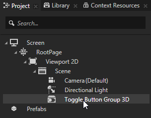
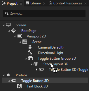
In the Projectpress Alt and right-click the node where you want to create a toggle button group and select either Toggle Button Group 3D, or Toggle Button Group 2D. Note that you can create a 3D node only inside 3D nodes, and 2D node only inside 2D nodes.
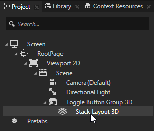
In the Project in the toggle button group create a layout that arranges the toggle buttons in the toggle button group node. For example, if you created a 3D toggle button group, create a Stack Layout 3D node, if you created a 2D toggle button group, create a Stack Layout 2D. See Using the Stack Layout nodes.
In the Project create a toggle button prefab and drag several toggle button prefabs from the Project > Prefabs to the layout inside the toggle button group to instantiate them in the toggle button group. See Using the Toggle Button nodes and Using prefabs. For example, if you created a 3D toggle button group, create a Toggle Button 3D that contains a Text Block 3D. If you created a 2D toggle button group, create a Toggle Button 2D that contains a Text Block 2D.
In the Project select the toggle button prefab and in the Properties click and add to the toggle button the Index in Group property. Kanzi uses the Index in Group property to keep track of which button is selected in a Toggle Button Group node.
Create a state manager that defines the toggle button in each state. See Using state managers. For example, create a state manager with two states that use the Toggle State property as their Controller Property, and define that when the Toggle State is 0 the text in the toggle button reads Off, and when Toggle State state is 1 the text reads On.
In the Project select the toggle button prefab, in the Properties add the State Manager property, and set it to the state manager you created in the previous step. In the Preview when you click the visual representation of the toggle buttons in the toggle button group, notice how only one button can be active at a time.
Setting the background of a Toggle Button Group 2D
Use brushes to set the background of 2D nodes. In Kanzi all 2D nodes by default have transparent background.
To set the background:
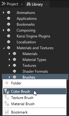
Create a Color Brush, a Texture Brush, or a Material Brush. See Using brushes.
In the Project select the 2D node the background of which you want to paint. Note that you can set only the background of 2D nodes.
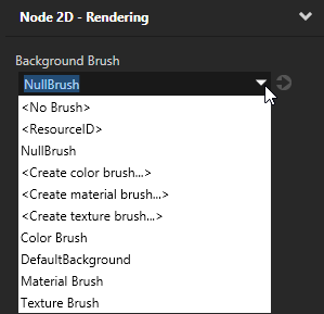
In the Properties click , add the Background Brush property, and select the brush you created in the first step.
Using Toggle Button Group 3D in the API
To create a Toggle Button Group 3D object with three toggle buttons:
// Create a Toggle Button Group 3D named Toggle button group and add it to the scene.
ToggleButtonGroup3DSharedPtr toggleButtonGroup3D = ToggleButtonGroup3D::create(domain, "Toggle button group");
scene->addChild(toggleButtonGroup3D);
// Create a Stack Layout 3D named Stack layout and add it to the Toggle button group.
// This stack layout is used only for arranging the items in the Toggle button group.
StackLayout3DSharedPtr stackLayout3D = StackLayout3D::create(domain, "Stack layout");
toggleButtonGroup3D->addChild(stackLayout3D);

// Create three toggle buttons and add them to the Stack layout.
ToggleButton3DSharedPtr buttons[3];

for (kzUint i = 0; i < 3; ++i)
{
    buttons[i] = ToggleButton3D::create(domain, "Toggle button");
    // Setting the Button Group Index property to -1, which tells the Toggle button group
    // to set the index of the toggle button.
    buttons[i]->setIndexInGroup(-1);
    stackLayout3D->addChild(buttons[i]);
}

// Print the index of the toggled button to show that the last button is toggled.
std::cout << toggleButtonGroup3D->getCurrentButtonIndex() << endl;

// Toggle the first toggle button.
buttons[0]->setToggleState(1);

// Print the index of the toggled button to show that the first button is toggled.
std::cout << toggleButtonGroup3D->getCurrentButtonIndex() << endl;
To create a Toggle Button Group 2D object with three toggle buttons:
// Create a Toggle Button Group 2D named Toggle button group and add it to the scene.
ToggleButtonGroup2DSharedPtr toggleButtonGroup2D = ToggleButtonGroup2D::create(domain, "Toggle button group");
viewportLayer->addChild(toggleButtonGroup2D);
// Create a Stack Layout 2D named Stack layout and add it to the Toggle button group.
// This stack layout is used only for arranging the items in the Toggle button group.
StackLayout2DSharedPtr stackLayout2D = StackLayout2D::create(domain, "Stack layout");
toggleButtonGroup2D->addChild(stackLayout2D);

// Create three toggle buttons and add them to the Stack layout.
ToggleButton2DSharedPtr buttons[3];

for (kzUint i = 0; i < 3; ++i)
{
    buttons[i] = ToggleButton2D::create(domain, "toggle button");
    // Setting the Button Group Index property to -1, which tells the Toggle button group
    // to set the index of the toggle button.
    buttons[i]->setIndexInGroup(-1);
    stackLayout2D->addChild(buttons[i]);
}

// Print the index of the toggled button to show that the last button is toggled.
std::cout << toggleButtonGroup2D->getCurrentButtonIndex() << endl;

// Toggle the first toggle button.
buttons[0]->setToggleState(1);

// Print the index of the toggled button to show that the first button is toggled.
std::cout << toggleButtonGroup2D->getCurrentButtonIndex() << endl;
 and add to the toggle button the Index in Group property.